The Complete FlutterFlow UI Widget Reference: Properties, Best Practices & Architecture Gotchas

In FlutterFlow, widgets are the fundamental atoms of your software application. Every single visual element, spatial gap, interactive button, and scrollable container compiles directly into Google Flutter's reactive widget tree.
However, many self-taught builders struggle with subtle rendering glitches: yellow-and-black striped RenderFlex Overflow exceptions, unbounded height errors, dropped frame rates on long lists, and brittle layouts that break on tablets or foldables.
In this technical reference guide, we examine every single FlutterFlow widget across all four primary categories, detailing key configuration properties, senior engineering best practices, and common gotchas to avoid.
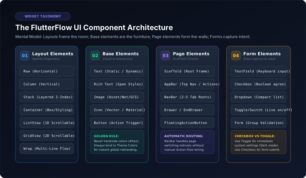
1. Layout Elements: Mastering the Spatial Tree
Container
The Swiss Army knife of FlutterFlow UI. Controls width, height, padding, margins, gradient fills, borders, rounded corners, and drop shadows.
• Key Properties: Width / Height (px, %, or Infinity), Box Shadow (blur, spread, offset), Border Radius (e.g. 16 for cards, 999 for pills).
• Best Practice: Always wrap items in a Container when you require explicit styling. For pure spacing without background color, prefer Padding or SizedBox to keep widget tree depth shallow.
• Common Gotcha: Setting height to Infinity inside an unconstrained Column throws an immediate RenderFlex unbounded height crash.
Row & Column
The foundational flexbox managers of Flutter. A Column arranges children vertically; a Row arranges children horizontally.
• Alignment Options: Main Axis Alignment controls distribution along the primary direction (Start, Center, End, Space Between, Space Around, Space Evenly). Cross Axis Alignment controls distribution along the perpendicular axis.
• The Overflow Solution: Placing dynamic text inside a Row without wrapping it in an Expanded widget will blow past the right screen boundary on narrow devices. Always wrap dynamic text in Expanded!

Stack & Positioned
Overlays child widgets along the Z-axis (depth). Use Stack for notification counter badges on icons or text placed over a background photo.
• Best Practice: Wrap inner widgets in a Positioned container to set exact pixel offsets (e.g., top: 8, right: 8).
• Gotcha: Overusing Stacks for primary layout flow results in brittle screens that do not adapt gracefully to varying screen sizes.
ListView vs. GridView
Scrollable collections that virtualize off-screen elements for 60fps scrolling efficiency.
• ListView: 1D linear scroll. Bind directly to Firestore query collections or App State via Generate Dynamic Children.
• GridView: 2D grid scroll. Configure Cross Axis Count (e.g. 2 for products) and Child Aspect Ratio (width / height) to prevent card text truncation.
• Shrink Wrap Rule: When nesting a ListView or GridView inside a scrollable Column, you must enable Shrink Wrap to allow parent scrolling.
2. Form Elements: Reliable Data Capture
• TextField: Always choose the correct Keyboard Type (Email Address, Number, Phone, URL) to optimize keyboard layout for mobile users.
• PinCode: Segmented 4-digit or 6-digit OTP input field. Hook your SMS verification action directly into the On Completed event.
• Checkbox vs. Switch (Toggle): Use a Switch (Toggle) for settings that apply immediately (e.g. Dark Mode). Use a Checkbox for choices submitted as part of a form (e.g. Terms agreement).
• ChoiceChips: Excellent mobile replacement for bulky dropdown menus when presenting 3 to 7 concise options.
3. Page Elements: The Scaffold Framework
• Scaffold: The skeleton of every page. Always keep Hide Keyboard On Tap enabled so users can dismiss the on-screen keyboard naturally.
• NavBar: Configure bottom tabs at the project level across 2 to 5 root pages. FlutterFlow handles page switching automatically without manual action wiring!
• Drawer: Slide-out side menu for secondary links, account settings, and terms.
4. Custom Code Extensibility
When visual widgets hit their limit, FlutterFlow offers three levels of custom code:
1. Custom Functions: Synchronous pure Dart functions (date formatting, currency formatting).
2. Custom Actions: Asynchronous Dart functions (biometrics, NFC, custom API wrappers, haptic feedback).
3. Custom Widgets: Full Flutter StatefulWidget components importing any package from pub.dev.
Ready to build a production FlutterFlow application? Contact KinetixSoft for turnkey mobile app engineering.
Planning to build an app like this?
KinetixSoft designs, builds, and launches production-grade mobile and web applications on FlutterFlow, Bubble, Retool, Lovable, and Podio. We deliver 40–60% faster and more affordably than traditional agencies.
Book a Free Scoping CallRelated Guides & Articles
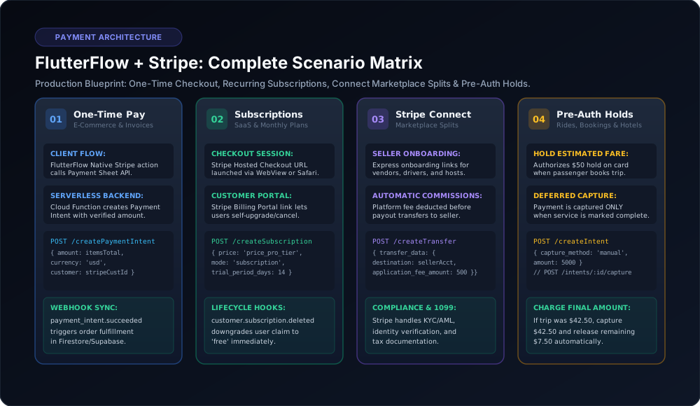
FlutterFlow Stripe Integration: All 4 Production Scenarios (One-Time, Subscriptions, Connect & Pre-Auth Holds)
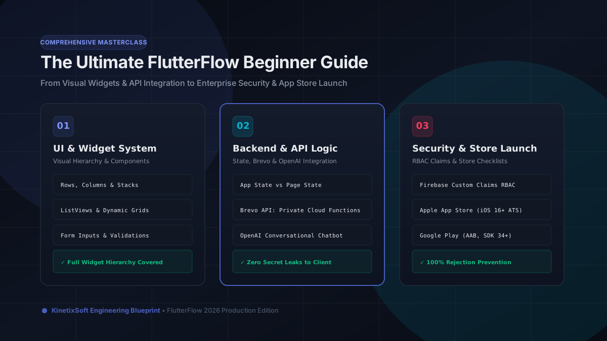
The Ultimate FlutterFlow Beginner Guide (2026): From Visual UI to Production App Store Launch